Simple tips to improve your website UX

Following our most recent blog post detailing the importance of website User Experience, we’re continuing this theme with these simple tips.
Before we begin, the key to all user experience related improvements is testing. Every permanent change that you make to your website design should be the result of extensive testing and be backed up with solid facts. Another key point to consider is your overall goal, what are you aiming to achieve? As we mentioned in our previous post, the key to UX is simplicity, and the following suggestions are centred on that.
Think about your content
The textual content on your site plays an important part in User Experience. Large chunks of text will ultimately drive visitors away from your site. It’s a simple ratio; the more text you include, the lower the maximum amount of words your visitors will read. On average, internet users read around 28% of page text, and skim read for key facts. Including the most important information higher up the page, improves reader efficiency, and less relevant facts or supporting text can fit further down. If you have to include a large amount of text, it should be broken up with headings and lists wherever possible.
The small things matter
When analysing your site’s UX to look for changes to test and implement, it’s often easy to look at the bigger picture and ignore the smaller details. Minor changes to the live chat buttons or text can have a huge influence on both conversion rates, and usability. To find out more on this topic, check out our blog on gathering more lead information online.
Here’s a great example of a small change you can make right away. Have you considered altering the text on your generic error pages to include more specific wording? Of course you want to limit the amount of errors that occur on your site, but when they do occur, why not make it humorous, or give clear instructions on how the visitor should proceed? For instance, ‘It looks like something went wrong with your payment, please click checkout again.’ Similarly, for a broken link, suggest alternative pages the visitor may find useful to continue their enquiry.
Show Similar/Related Products
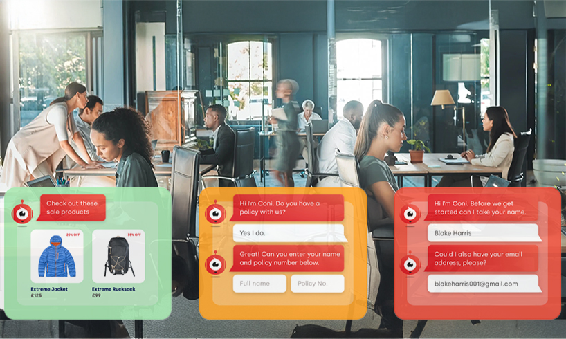
This tip is particularly pertinent to e-commerce websites. Offering suggestions on similar or related items carries two major benefits; the first being up or cross sell opportunities and the second increased user efficiency. Displaying related products offers alternatives within easy reach if the product you’re currently browsing doesn’t quite fit your requirements. In another scenario, presenting products that work alongside each other, allows customers to complete all of their purchases at once, saving time. For example, you could offer a mobile phone accessory pack alongside the handset itself.
Provide Intuitive Navigation and Website Search
Navigation is vitally important for all websites. A good intuitive structure that makes it simple to find information and products is a must when it comes to good user experience. Statistics have shown that the majority of site visitors will use the navigation bar first, and then turn to a search box. This highlights the importance of providing both, as an effective search engine will aid both simplicity and efficiency on your site. You should also think about the wording on your navigation bars, are they straight forward and easily understood?
If you have enjoyed this blog on UX experience, you can check out all our other posts right here. Or alternatively, follow us on Twitter and ‘Like’ us on Facebook to receive all our great content first.
