Personalising Chat Inside and Out: Part 1
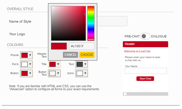
For live chat to prove successful for organisations it needs to be customised to fit seamlessly with your website and it needs to be configured, for operators to effortlessly be able to handle enquiries. In part 1 we will be looking at customising the visitor facing aspects.
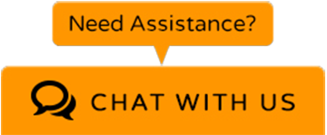
It all starts with your chat button. This needs to be designed to be visible, but not too big that it interferes with your page layout. The button should be a colour that doesn’t blend into the background to help with visibility, but it shouldn’t also clash with the website. Many companies will use a secondary colour that they already used on the website that highlights key sections or call to actions.
Before Entering a Chat
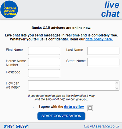
Companies can select whether to use a prechat form or not before a chat session starts. The fields can be completely personalised to gather the information your organisation requires. This can include:
- Name
- Company Name (B2B environment)
- Email address
- Phone number
- Reference number
- Postcode
- Which department they wish to speak with (if multiple are using chat)
- Nature of enquiry
The prechat form can also be customised to contain your company logo and be set to the same colour as your chat button or completely different. Some organisations will include links on the form to important information such as, privacy policy or other areas to signpost visitors away from chat depending on whether they use the communication channel for specific enquiries only.
During a Chat
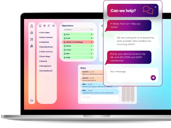
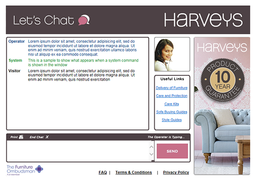
The dialogue window is the area that visitors will spend most of their time in whilst using the communication channel. It should be the same colour as the prechat form to be consistent and can also include the company logo. Depending on the style and sizing of the window, marketing materials can be included to advertise products, important contact numbers or links. It can also contain operator photos to provide a more personal service.
After a Chat
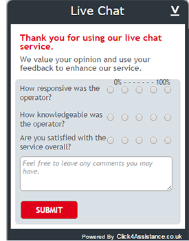
Surveys can be presented after the chat has ended to gain instant feedback. The fields and questions can be personalised to find out how they find the service in general, the operator’s knowledge and professionalism, and that their enquiry was answered. Once completed this will present a confirmation / thank you window, if a survey isn’t used the visitor can be directed straight to this page instead.
Chat not Available
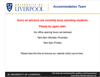
When your chat is unavailable an offline button can be displayed. Some organisations will use the same colour as their online button; others have used different colours to differentiate between the live chat statuses. This can also be done with the window colours, which can contain a call back form or operational hours. Alternatively when chat is in its offline status, the button can be hidden altogether.
It is important to personalise your visitor facing aspects as it promotes your brand and visitors will feel confident they are speaking directly to your representatives. Your chat experience can be customised within the solution by navigating to ‘Tools/Chat’. You can upload your own images, selecting which to use within the flowing layout. The style can be amended using either the simple ‘WYSIWYG’ or the advanced ‘coding’ options.
Next month we will be looking at how to configure the solution to give your operators the best user experience, so keep your eyes peeled for that.
For more information on how to customise your chat experience, take a look at our guides within the help system of the software or contact our team on 01268 524628 or email theteam@click4assistance.co.uk.

