Catching Your Visitors’ eye with Promotions
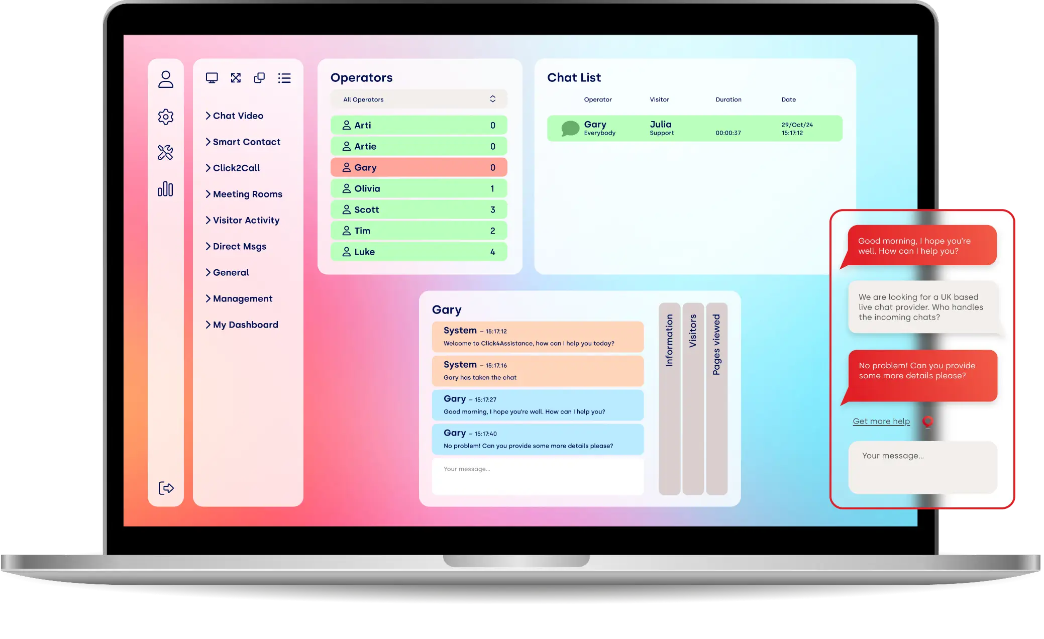
Promotions are part of the new enhanced solution ‘Experiences’ by Click4Assistance. With the ability to present any image, promoting your products, service, special offers, or important messages, Promotions enable you to communicate with your website visitors automatically.
They are an image that also contains a related URL, when clicked upon the visitor is automatically redirected to the specific page. This proactive experience presents to the visitor based on a number of rules, what page they are on, how long they have been on the website etc.
But how do you encourage the visitor to click? There are a number of psychological areas that can be manipulated to evoke emotion within the visitor and help them decide to click through.
Language
The language we use can be the difference between a visitor accepting or declining the Promotion. There are certain aspects of language we can use to make a Promotion more eye catching:
Surprise
In our brains, we have pleasure centres that are stimulated when we have enjoyable experiences. Surprises or unpredicted pleasant things grab our attention much quicker as people subconsciously prefer an unexpected experience over something they know.
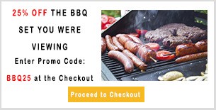
In practice, if a customer is expecting to pay full price for a product or service, using a Promotion to provide a discount code without any catches (sign up for a newsletter / spend over £30) can be a great way to surprise and grab the customer’s attention.
Questions
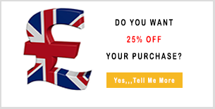
In a headline, questions work as the reader wants to know the answer. Using rhetorical questions on your website and in Promotions can leave the visitor wanting further information.
-Do you want a discount code?
The majority of your visitors should answer yes to this and they will want to know what they need to do to get the code, so ensure it is obvious on your Promotion that they need to click through to receive it.
This is similar to the Curiosity Gap, the space between something a person knows and something they want to know. It can simply be a question or a statement that makes them start to think about the subject. Using your Promotions to provoke the feeling that they are missing information can make your visitor click yes and fill in the gap in their knowledge.
Negatives
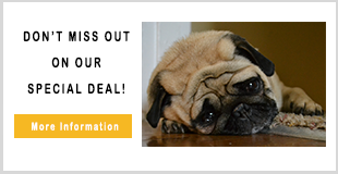
By using negatives in your text it can evoke the visitor to continue with the desired action such as accepting your Promotion. For example, using don’t, worst and stop grabs our attention as we want to ensure we are doing the best we can and not doing anything that will jeopardise that.
Visual
Colours
We all have our personal experiences with colours; some of us may prefer blue over red, have a fear of some colours, or are transported back to a memory by looking at others. Therefore when brands use colours we already have a perception, subconsciously deciding if the colour fits with the product and/or the brand.
For example, Coca Cola is an instantly recognisable brand “94% of the world population recognise Coke’s red and white logo”
However, this wasn’t always the case, Strategic Factory mentions in their article, that “There was a time in the 1980s when “Coke” was struggling a bit with brand recognition. They had released Diet Coke and Cherry Coke, and the lack of consistent colours coupled with the scripted Coca-Cola logo being replaced with a block-like Coke logo caused these different flavour variations to be seen as competition instead of all in the same cola family. It was also found that there were variations in Coca-Cola’s “one true red.” The colour differed from country-to-country, state-to-state and even from store-to-store!”
It is important that brands consider their colours and are consistent with their branding. Different colours have different meanings linked to emotions.
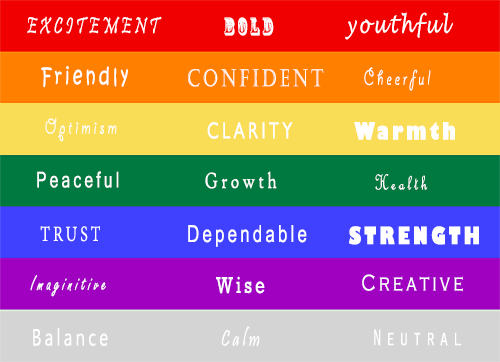
When choosing colours for your brand, website or Promotions, it is not just psychology you need to take into account, it’s time to think back to art classes and select colours that actually contrast well with each other, otherwise, you will end up with an ugly clash that will certainly evoke emotion into your visitors but it won’t be a positive one!
When it comes to colour it can get pretty complicated as a computer has much larger range than the 12 basic teriay colours (mix of primary – red, yellow, blue and secondary – green, orange and purple), including tint (hue – the pure colour + white), tone (hue + white + black) and shade (hue + black)
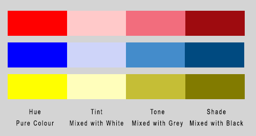
So how do you choose the right colour?
Start with a colour you like within the emotional trigger you want to evoke, and build your colour scheme around it.
Colour Context:
If you change the background colour does your chosen colour appear brighter, softer or becomes overpowering?

Using a darker background can make a call to action button more prominent helping to define it as a clickable component.
Complimentary Colours:
Using complimentary colours can highlight differences or main elements, as a main colour is used with the one directly opposite them on the colour wheel.
The use of shades, tints and tones can lessen the intensity of these contrasts and ensure they are not overpowering, attracting the visitor to click.

Images
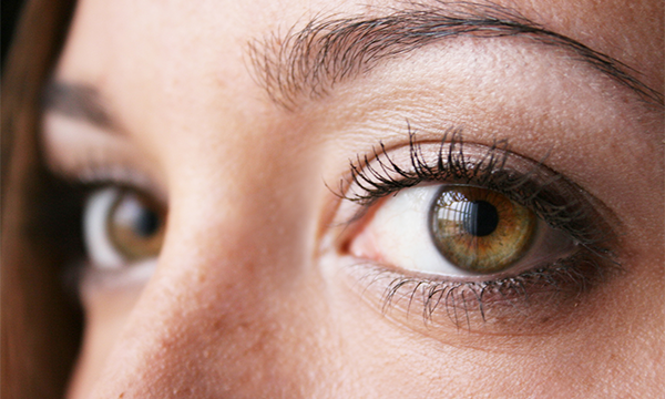
Using the right image can persuade the visitor whether or not to accept your Promotion as “90% percent of the information that our brain gets is visual.”
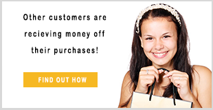
The use of the correct stock image can elicit real emotions in your visitors. They could perhaps place themselves in the image; it can stir feelings of happiness or sentiment, or stimulate our minds as we view them, after all a picture is worth a thousand words.
The image used should also relate to your promotion, if you are giving them a discount the visitor would expect to see an image relating to money or shopping rather one of a dog or a park etc.
Lastly the image should be of good quality and in proportion; nothing frustrates a person more than viewing a grainy / out of focus image that doesn’t fit correctly on the page.

In Words of Cinderella’s Fairy Godmother
“Put ‘em together and what have you got”
No, not bippity-boppity-boo, you have a well-designed Promotion that is certain to evoke emotion within your visitors that has them clicking instantly.
Now that your Promotion has been designed it is ready to be added to your Click4Assistance account, to add live chat to website start our trial. For help setting these up download our customisation guide from our support page, contact our support team on 01268 280826 or email support@click4assistance.co.uk.
Sources:
https://blog.kissmetrics.com/headline-psychology/
https://blog.hubspot.com/marketing/color-theory-design
http://www.copyblogger.com/powerful-images/

